Last time I wrote about double exposures, I tried to cover a broad cross section of approaches. In this entry, I want to talk more about how double exposures work and what you can look for. It is a meditation on darkness, shadow, & black holes.
I had a sit down with some folks last night who were interested in taking better multiple exposure shots. I hadn't realized what I knew versus what other photographers knew about it. I have only shot film for a year and 70% has been multiple exposures. It's the medium I prefer. In talking with these folks, I began to understand what I have come to know, almost innately, about what does and doesn't work for multiple exposures.
Once again, I am no expert. I haven't taken classes or had a chance to work with a mentor. I welcome that, but it hasn't happened yet. I am not saying this is the end all be all of double exposures, but I do think I have a darn good grasp on the subject and part of it comes naturally to me. I know how to make the accidents happen.
Here are a few of the things we discussed and what advice I was able to offer.
+ Film needs light:
What? Of course film needs light. But here is what I'm getting at. On an exposure, if the first shot has solid contrast between light and dark, like a silhouette, then you end up with spots on the negative that haven't gotten any love. It's empty. So what happens on the next exposure? You have a negative space to fill. The rest of the shot has already left its impression.

+ Darker Colors are your friend
When you double your shots you need to decide what you want to be your primary focus. You can blend two images together or use one as a texture. Either way, if you shoot bright yellows, whites, light blues, pastel colors; you will have those colors come through more. Dark blues, greens, reds, browns, and grays; will be muted and lend their textures and form more than a true solid image.
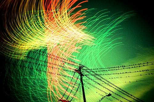
Parking Lot vs Birds at Sunset:
A great example and favorite subject of mine, is asphalt. Streets and parking lots with nice dark blacktop makes for awesome doubles. You can capture parking stripes and a lot of rough texture from these. Depends on how much light you let in on the second exposure. In this one I shot with Fuji MS 100/1000 multi-iso. Shot both at 400 iso. If I had wanted more texture from the parking lot, I would have snagged the sunset at 800 iso. What makes this possible is the small amount of light the asphalt is reflecting back at the lens. Of course, the parking stripes were white, so they showed up without an issue.
Yellow vs Red:
In this shot, you can clearly see the bear through the red colors of the arrow head. The parts that fall into the yellow zone are much harder to see. A good example of the dark vs light colors.

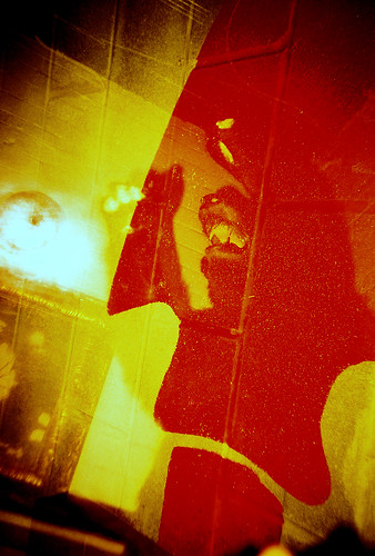
Erica VS Red Dots:
This is a great example of black sucking up light. I shot this cinder block wall during the day. It was painted a matte black with red polka dots. I shot the whole roll at different angles and distances. It was 400 iso film and I shot at 800. Then, that night, I shot Erica at 400 iso using my Colorsplash flash. The red dots stay put while the black fades away and fills up with the 2nd exposure.
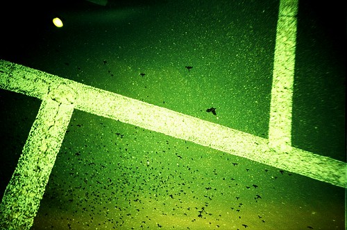
Building vs Road Stripe:
A good example of texture but no color from asphalt. The building was well lit and the parking lot stripe is the only color that remains from the first exposure.
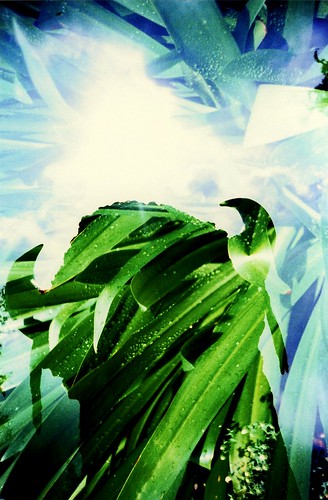
Statue vs Plant:
The plant was exposed first, which is why you can see all of it. Then, the silhouette created by me being behind the statue shooting toward the sun created the darkness needed for the plant to stay the primary image. It fills in where it was darkest, but is blown out by the sky around the shadow.
Macy vs Ghost Fish:
This one didn't look that neat to me when I first picked it up from the developers. A second look made me smile. The first picture was of a koi pond at the National Arboretum. The water was so dark, the orange koi was the only thing that came out from the first exposure. The second exposure of Macy taking a picture of the pond made the fish float in front of her.
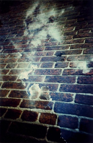
Brick vs Sky:
This is an example of darker colors helping out. The bricks weren't black but dark reds, maroons, & crimson colors are all going to work, as well. The bricks weren't getting any direct sunlight so they added their texture and image without being to overpowering. The sky was bright in places but the clouds helped to keep the bricks visible. Had it been a bright sky w/o clouds the brinks would be far more subtle.
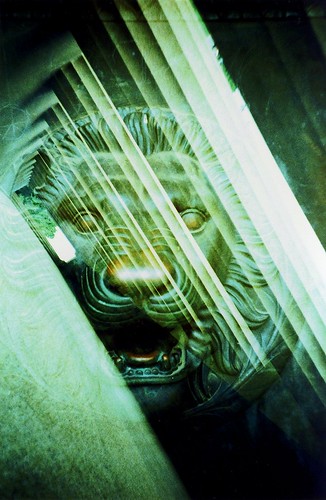
Lion vs Columns
This one deals more with shadows. In this, the Lion head was on a door that was heavily oxidized. The door it self was too dark to really make its presence known. The columns were very white concrete. They should have blown the lion out of the shot, save for a few subtle features. Instead, because the hall of columns has so much going on with the shadows they create, the lion head comes through clearly wherever the shade is.

Eddie vs Reed Thatch:
In this one, I used a blue flash to bring the whites out on the Eddie Munster stencil. Then, I used an orange flash on the reeds. This pushed the reeds through the black part of the stencil while my first flash held the white part of Eddie in place.

Tile Corner vs Wooten Bldg.:
The darker color tiles in the corner of a restroom that wasn't brightly lit make for a shadowy texture over a well lit day pointing the camera away from the sun.
+ Night time is the right time for doubles
So, obviously, if darker colors and blacks are favorable in double exposures, then night time and clever flash usage should give you great results. You already saw the Erica vs Red Dots picture. That is a prime example. You can control what gets exposed on film better when you control the lighting of your subjects. Neons, Signs, clever flashes on walls and friends; all of these can be used to great effect.

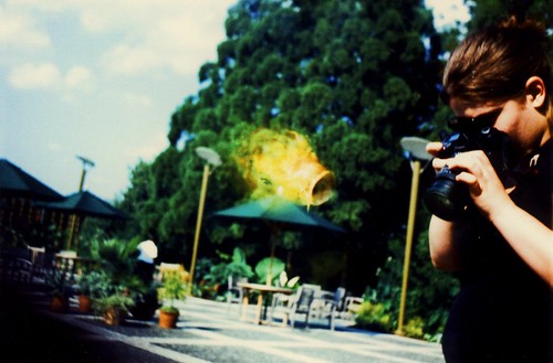
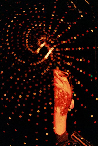
Rickey vs Fire:
A simple example. I shot the bbq pit without a flash. So the fire is the only thing that will really show up. Next I grabbed a shot of Rickey with a green flash. I shot upwards, so I wouldn't catch any background imagery.
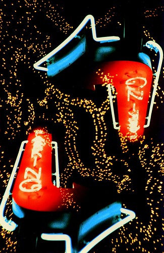
Parking vs Parking:
This shot is an inversion. A neon parking sign with a x-mas light covered tree in the background. I shot this once, flipped the camera, and shot again. I was shooting with 400 iso and no flash. I grabbed only the most powerful light in the scene and left all the unnecessary bits out.

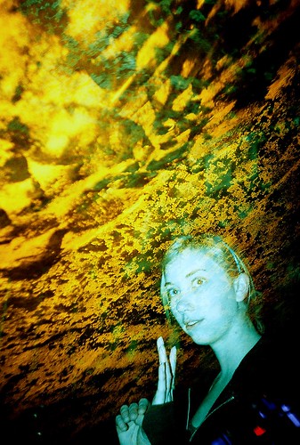
Bench vs Ladies:
In hind site, I should have used a yellow or orange flash for one of these exposures. blue and green are too close together and don't differentiate enough. Still, green flash on park bench and blue flash for the ladies. They mesh together a bit, but there isn't anything else left to interfere with the shot composure due to the night time's loving blackness.
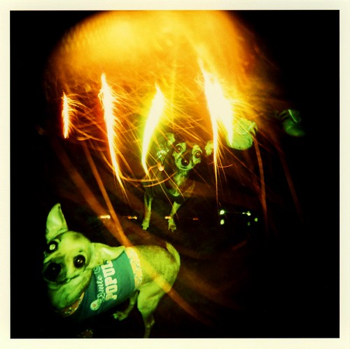
Pups vs Roman Candles:
This was a bit more inventive. I shot a whole roll, in my Holga, of roman candles being shot over it and around it. Then, I rewound the film and shot some family members and the like. The dark environment means I can shoot the puppies with a flash and isolate them from their context and layer them over something else.
Mary vs Ceiling:
This one was a combination of dark colors on the ceiling and the angle of my camera & flash. The ceiling gets a more left dominant exposure while Mary gets a blue flash and right dominant placement. So the flash illuminates both corners of the shot due to the way I angle my camera away or towards the subject.
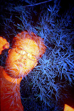
LomoCam vs Bokeh:
I'll admit this one was a complete accident. I took the shot of the giant x-mas light tree above me, unfocused, for the first exposure. Then I used an orange flash for my face. Turns out the flash was blocked by the extension of the SLR lens. So only half my face gets lit. Weird effect you could only have gotten at night.
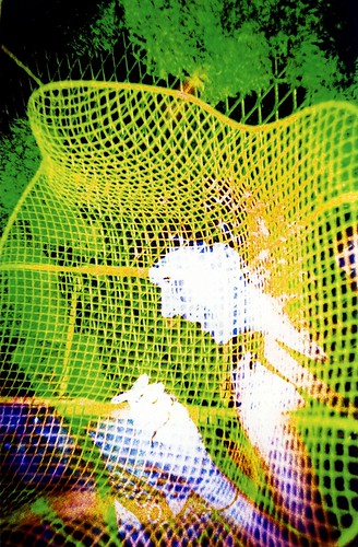
Unknown Lady vs Wire Chair vs Metal Mesh Wall Covered in Moss:
So this is a triple. Which is why the gal's face is all blown out white. Too much light at the center of the shot after 3 exposures, I guess. Blue flash for the woman, Yellow flash for the chair, & green for the metal mesh wall covered in moss. Each is able to be isolated and added to the shot with a flash because the night conceals what your flash doesn't touch.
In the end, these are just basics. Ideas to grow from. I'm not telling you to shoot the way I shoot. Just use this to understand how your environment responds to color and light for layering shots. The only way I figured all this out was shooting loads of film and searching through other's double exposures on flickr.
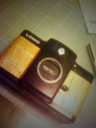
Yesterday was my 1 yr anniversary of shooting on my LC-A+RL. The camera that truly gave me a handle on double exposures and helped me refine my methods. I have taken over 3700 pictures with this Lomo in the last 12 months. 75% were doubles. I love this camera and I dedicate this blog entry to it's glory and magic it brings out of my life. Keep Snapping Shutters! Make your pictures worth 2000 words.

These are all incredible, thanks for sharing!
ReplyDeleteDude, keep up the good work with the blog!
ReplyDeleteThis comment has been removed by the author.
ReplyDeleteawesome!!
ReplyDeleteu're really inspiring..
i will try all the techniques..
thanks a lot! :D
~greeting from Malaysia! :D
I love the koi fish hiding in the trees but looks creepy he he
ReplyDeleteindoor koi pond